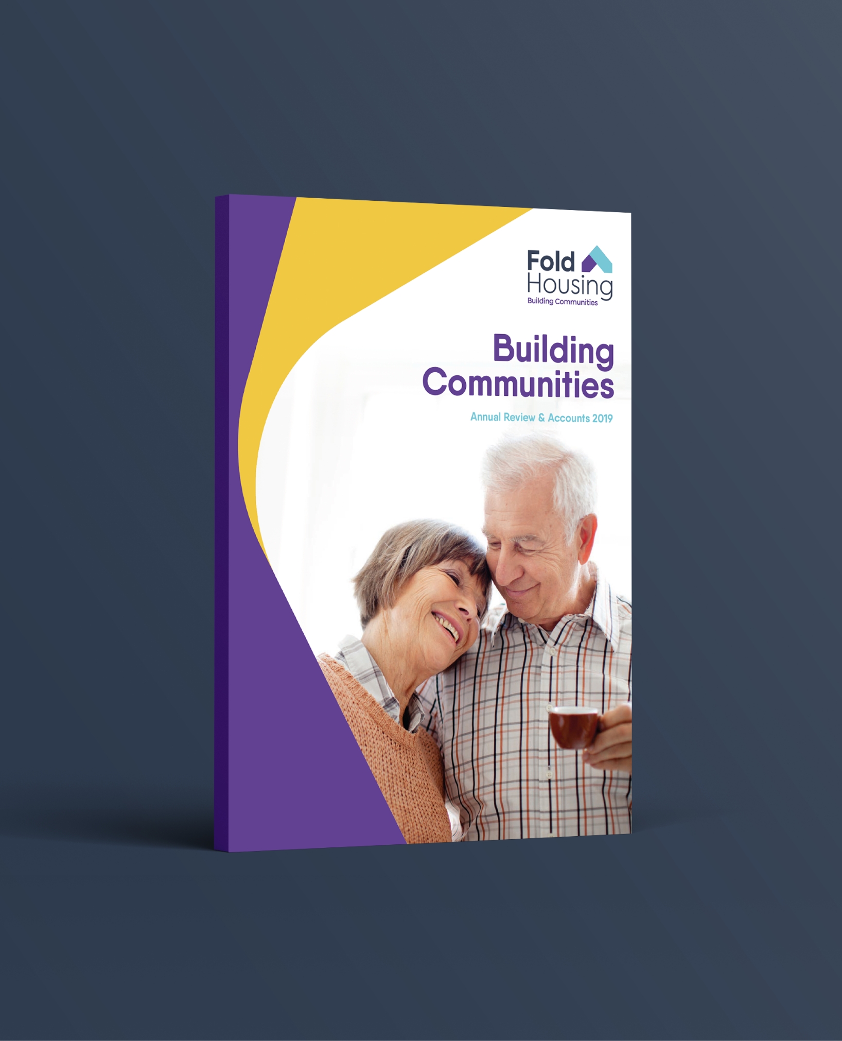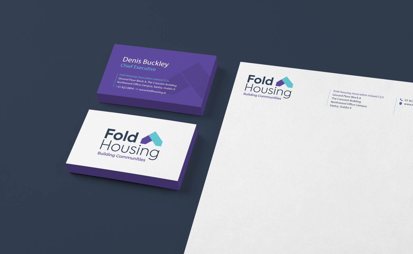
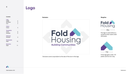
Recognising the need for a reimagined brand identity that establishes a strong connection with its target audience, the development of Fold Housing’s new logo mark was a pivotal element. The logo mark, expertly crafted to take the form of a roof, serves as a potent symbol embodying the very essence of Fold’s mission—to extend protection and support to vulnerable individuals and families in need of housing.
Moreover, great care was taken in the selection of a meticulously curated colour palette. This palette was deliberately chosen to evoke a sense of calmness while exuding a profound sense of positivity. By doing so, Fold Housing’s commitment to creating a nurturing environment that envelops and uplifts the individuals they serve is effortlessly conveyed.

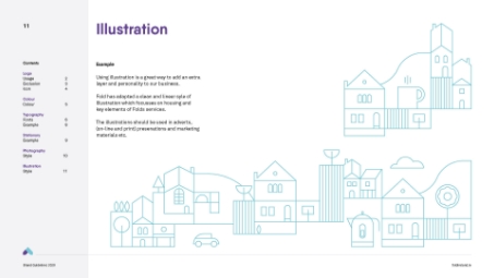
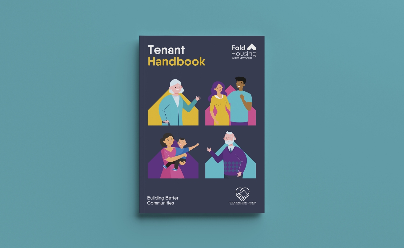
Throughout the brand development process, Fabrik created illustrations that effectively represent the diverse user base of Fold. These illustrations vividly capture the essence and diversity of the individuals who benefit from Fold’s housing services. By showcasing the range of people they support, the illustrations foster a deep sense of inclusivity and relatability, further strengthening the bond between Fold and its beneficiaries.


The combination of the logo mark and the carefully chosen colour palette intertwine seamlessly to create a cohesive and resonant visual representation of Fold Housing’s unwavering dedication. This revitalised brand identity fosters a profound connection with its target audience, allowing Fold Housing to forge a powerful bond as it continues its mission of providing high-quality, affordable, and accessible housing options.